Friday, August 26, 2011

The Noun Project

Check out The Noun Project, a catalogue of icons free for every designer, illustrator, architect, or anyone to use! Below is their mission statement and a few images of some music posters designed by Viktor Hertz, using the icons provided by The Noun Project. Chekck out Viktor's work here.

“Sharing, celebrating and enhancing the world's visual language”

The Noun Project collects, organizes and adds to the highly recognizable symbols that form the world's visual language, so we may share them in a fun and meaningful way. Here is our pledge to you:

FREE

The symbols on this site are and always will remain free. We believe symbols can not be effectively shared with the world if they are not free.

SIMPLE

Everyone likes simplicity. We want you to be able to come to our site and effortlessly find and obtain what you are looking for. Simple as that.

FUN

We think a language that can be understood by all cultures and people is a pretty amazing thing. We also think our symbols and the objects or ideas they represent are works of art worth celebrating.

HIGHEST QUALITY

We get excited about things like scale, proportion, and shape. We are committed to design and quality in everything we do.


Monday, August 22, 2011

Stationary Design Now!

I try not to re-blog too too much, but I couldn't help myself from sharing this! While stumbling around on David Airey's website, Identity Designed I came across the book, Stationary Design Now! and I can tell you one thing, this book has my name on it! I am certainly putting this one on my wish list. Here is the link to the Taschen site if you would like to pick one up for yourself...or for me!


Sunday, August 21, 2011

Sketchbook Highlights

Here are a few photos of my most recent sketchbook. I would like to swap these images out for better scans eventually, but for the time being these will have to do! I think sketching is oh so important, it allows you to remember certain moments of your life you would never retain otherwise. I also feel it is a hugely under appreciated part of the design process for all designers. If I start a project without sketching beforehand I feel as though I am missing something towards the end of the design process. Anyways, enjoy and I hope I find the time throughout the packing madness to update these photos to better scans!


Thursday, August 11, 2011

Tivoli Posters

So after visiting Tivoli amusement park, I was hugely inspired by the elaborate display type, funky posters, and vintage signage. I started to do a little searching and stumbled upon this great archive of mostly all the posters that have been designed for Tivoli each year. I pulled a few that struck me. Below I added the name of the artist/illustrator. Take a look at these works of art!

Ebbe Sadolin 1980
Franz Sedivy 1913

Lars Bo 1979

Helge Refn 1985


Thor Bõgelund-Jensen 1956

Thor Bõgelund-Jensen 1938


bjõrn wiinblad 1981


Poul Holck 2008

Poul Holck 2008, detail.

Thor Bõgelund 1952

Arne Ungermann 1945


Unknown

Unknown
Bent Holstein 1983

Ingela Arrhenius 2005
Valdemar Andersen 1911

Sunday, August 7, 2011

Inspiration and Fun at Tivoli Gardens


Believe it or not, previous to this Saturday I had never stepped foot in Tivoli Gardens! Somehow, even after spending three consecutive summers in Copenhagen I never managed to get myself there! Boy did I choose the best day. The sun was shining and there was not a cloud in the sky (okay it is Denmark, so I am sure there were a few).

Tivoli is a famous amusement park in Denmark which is quite different from amusement parks in the American sense, some even call it a 'pleasure garden'. Although the rides are the main attraction, the park is filled with tons of quaint cafes, beautifully trimmed gardens with flowers galore, sweet little ponds, and lots of outdoor seating for lounging in the sun. Tivioli was opened in 1843 and has been running seasonally ever since. Since Tivoli has been around for over 16 decades, there is an overabundance of fantastic vintage signage to ogle at.

The second we stepped foot inside the park, I was overstimulated by the colors, funky graphics, and elaborate detailing. Take a look at some of the images I captured of Tivoli's old style charm. I hope you get as many new design ideas as I did!

The original signage for the park that sits on over the arch on the main entrance.

Some Parisian inspired art nouveau typography.

Love this 50s inspired script, and I love the fact that this company is based in New York! There are signs pointing me in the right direction everywhere.

Great color combo! I am gushing over the distressed quality of this sign.

The hand-painted exit sign for the balloon themed ferris wheel.

Although the style of this street sign is not specific to Tivoli, but rather Denmark, I still decided to snap a photo. I love the care that goes into making these street signs, such a difference from the States. Coincidence that the street name is 'quality'? I think not!

A gorgeous hand-painted mural made for the 150th anniversary of Tivoli. Below are some up close shots of the details.


Colors galore!

Here is the baloon themed ferris ride we went on.

Colors so great, even if they have been faded by the sun! Love the crackling paint too!


Seeing all of these light up signs makes me want to snag one from an antique shop in the future.

It would be unfair not to post some images like these, my apologies for not getting a shot of cotton candy! Maybe that will be my excuse to go back?


Love love love this. Nothing more to say.

I need to find this on fabric! I was blown away by the quality of some of the textiles on the wall surfaces in Tivoli.

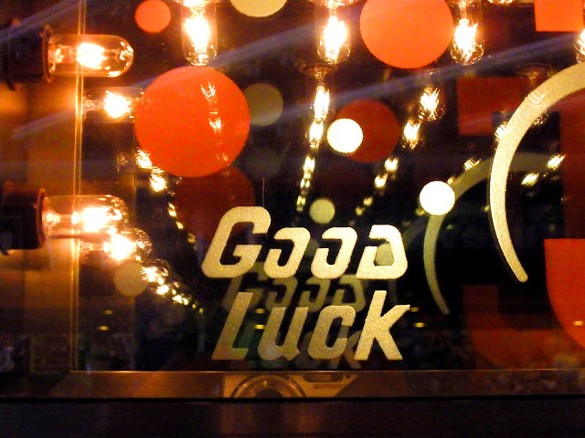
I hope this is wishing me good luck on my job search!

I want this in stamp form.

I can't tell what I like most about this photograph, the blue and red together or the signage...

There was an entire building with these designs painted on top and it wrapped around the entire building. I love the idea of mixing rounded forms with geometric. You can't tell here but the painted gold sections are actually letter forms.

And last but certainly not least, one letter from the illustrated type Tivoli uses from time to time. I just thought this one was so much fun.